"I pay attention to what it is like to see things, and make sense of the space around me"- Stephen Shore
We studied the work of Stephen shore and learned about how to use light, space, shadow, composition, colour, form, framing, symmetry, lines and positive and negative space. In an informative Guardian newspaper interview Stephen said; "To see something spectacular and recognise it as a photographic possibility is not making a very big leap, but to see something ordinary, something you'd see every day, and recognise it as a photographic possibility - thats what I'm interested in". I love this quote from Shore as I think it really entices the essence of his style of photography and explains to me, in detail, how he 'sees' things.
Another really important quote of Stephen Shore's is; "Theres a kind of visual thinking going on, that is without words, and not even just words spoken or in ones head as most people think thinking is to do with words, you know, like this little voice in your head, but theres this visual thinking that doesn't have that". I think he is saying that as a photographer you develop a visual intelligence of artistically looking at ordinary things, however these skills are automatic and as photographers we tend to evaluate our images subconsciously. The real challenge is being able to evaluate your own images in words and translate your own visual tendencies in to a description that others can understand and make sense of.
I took this quote from a short Youtube video called American Beauty, which is embedded below.
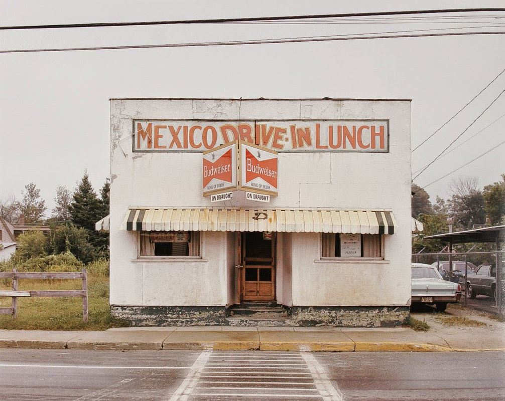
A short evaluation of one Stephen Shore image taken from his collection American Surfaces:
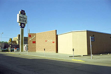
Gallup, New Mexico, July 1972
1) Simply describe what you see in the image by writing as many things as possible. Retro, perspective, linear, peaceful, beautiful, midday. The artist draws out the primary colours in this image and this creates a serene feeling in me. 2) What do you find unusual about this image? There are no clouds in the sky and no cars on the road, which makes this place being photographed seem very still. I can only see one person on the left side, so the photographer was clearly focused on capturing the architecture rather than the people. |
3) What do you find interesting about the photo?
I find, when scanning my eyes over this picture, that my eyes are immediately drawn to the light cream coloured building on the right hand side. Then slowly moving left to the sign post which says ‘Merchants Bank’ which seems to be separating the chaotic, busier, more compacted side of the town and the large open, bright space. I find this interesting because I think the photographer is trying to make a usually busy, fast-pace town look peaceful and beautiful. I think he has done this perfectly with an intriguing perspective. 4) How does the photographer use ‘space’ within the image?
Everything is situated in the middle. It looks like he has used the ‘rule of three’. The image starts simple on the right and gets more complicated as move your eyes left. He has chosen to photograph this image on a clear, bright day and this is affective because the sky has become a huge backdrop (block colour), and the dark road provides a nice contrast to this in the foreground. |
Below is a gallery of Stephen Shore images:
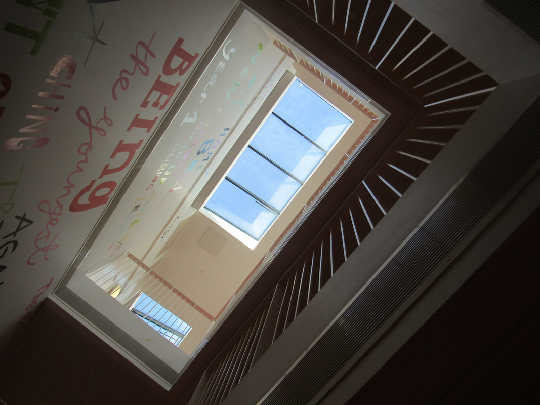
My first response to Stephen Shore - In school
My two favourite Stephen Shore inspired pictures:

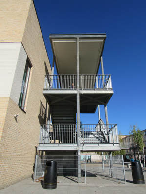
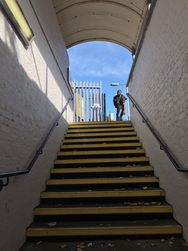
I admire how the light is proceeding from the top of the image, but then disperses into nothing as the photograph is submerged into darkness.
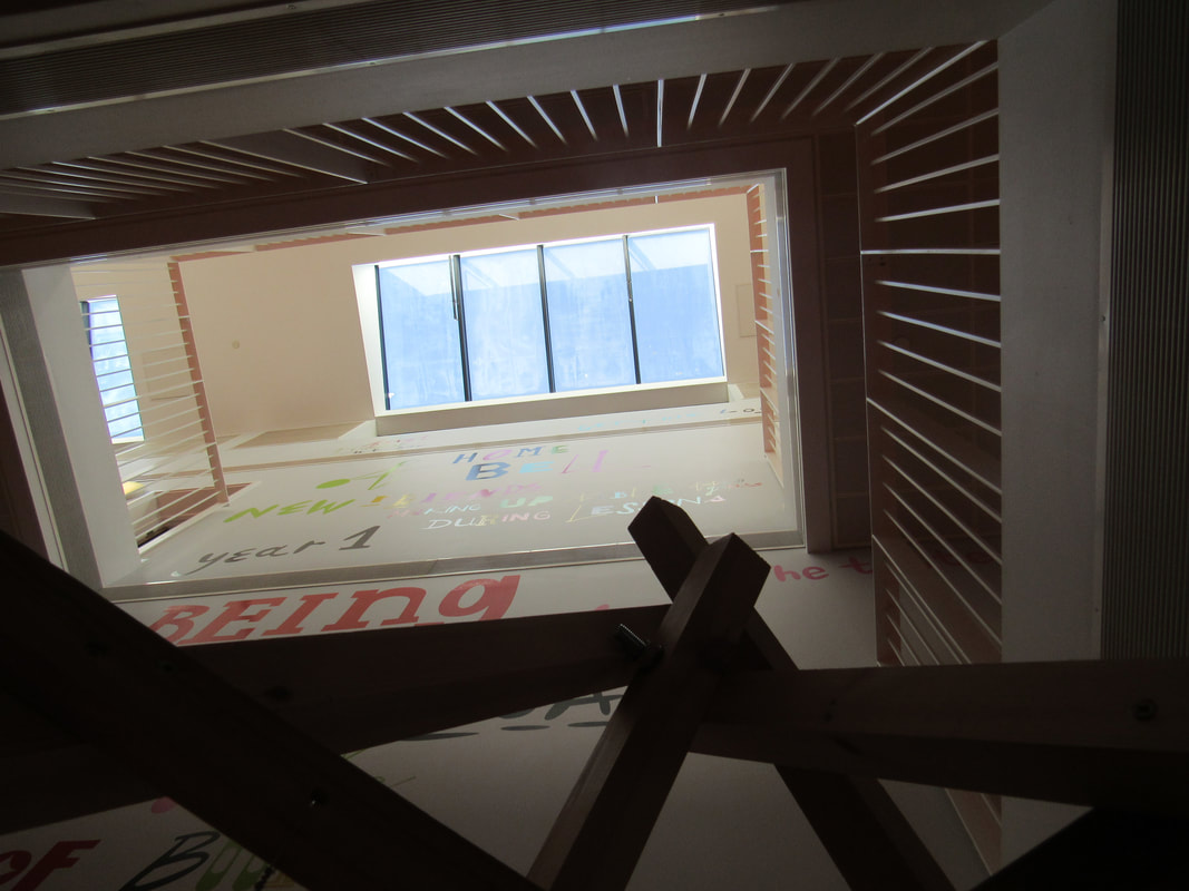
The odd, unambiguous object at the base of the image protrudes upwards and creates a divided contrast between the white walls and the light. This object seemingly is larger than the space above it as it creeps off the page into the enigmatic blackness. The perspective makes me want to use the lines of the banisters climb up to the skylight, open it and float out into the placid sea of blue. The defined geometry and harsh lines create an eerie feeling of uncertainty however, the word "Being" which is underlined with the unambiguous object, and the cool pastel blue of the skylight brings about a sense of safeness and serenity within me. Although, this image could be interpreted as 'unsafe' i guess if you consider falling from the top layer into the uncertain black abyss. |
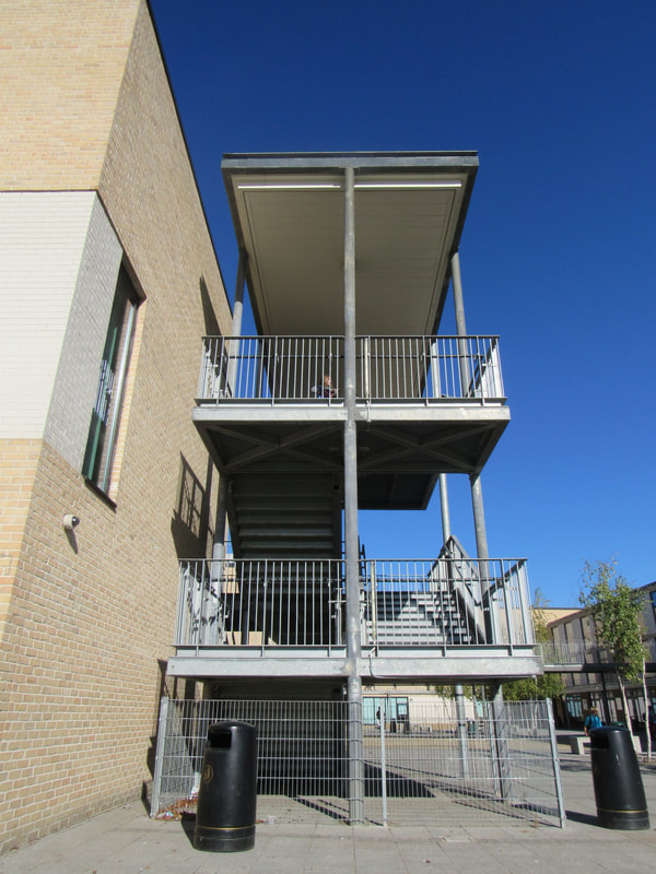
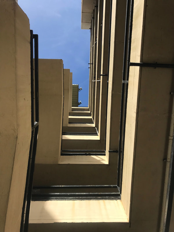
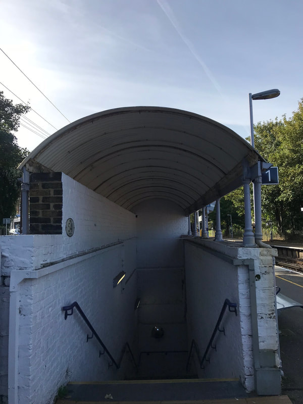
I enjoy the perspective of this image overall. It looks as if an omnipotent force is suctioning the objects upwards towards the sky from the ground. I can recognise many geometric shapes such as triangles, rectangles, oblongs and cylinders. The two bins are an intriguing part of the foreground. The right hand side one is set back slightly and seems to be getting suctioned away faster than the forward set bin which seems to be supported by the architecture around it.
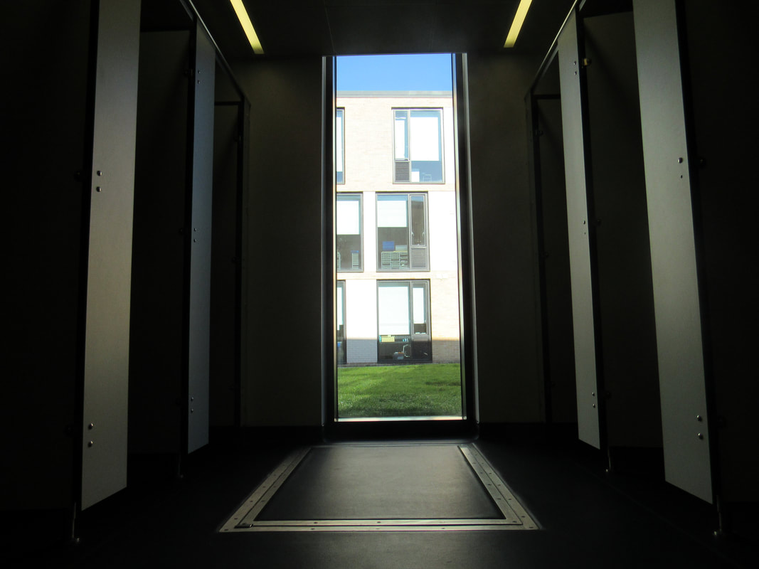
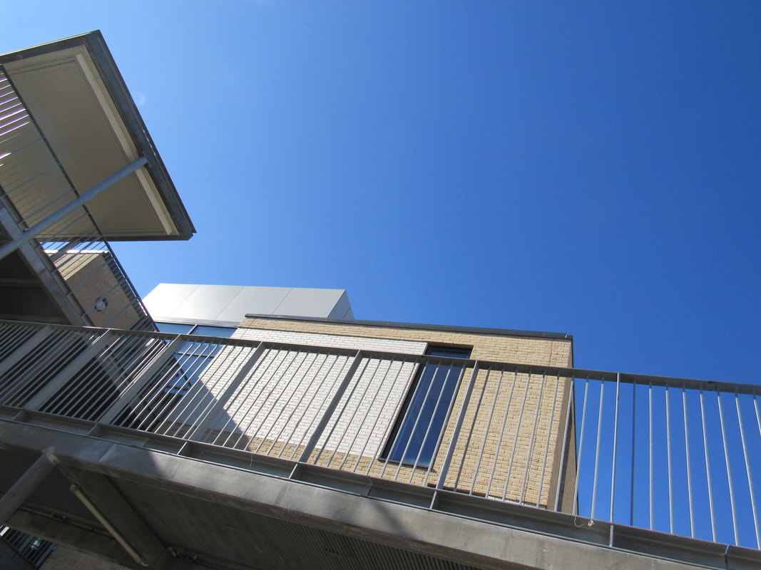
I find that the clear sky creates an alluring background to the staircase; a beautiful shade of blue. One criticism i can make to this however is that the right hand side looks too busy, I wish I could see what it would look like to remove that part of the picture as i think it would create a wholly more serene environment. |
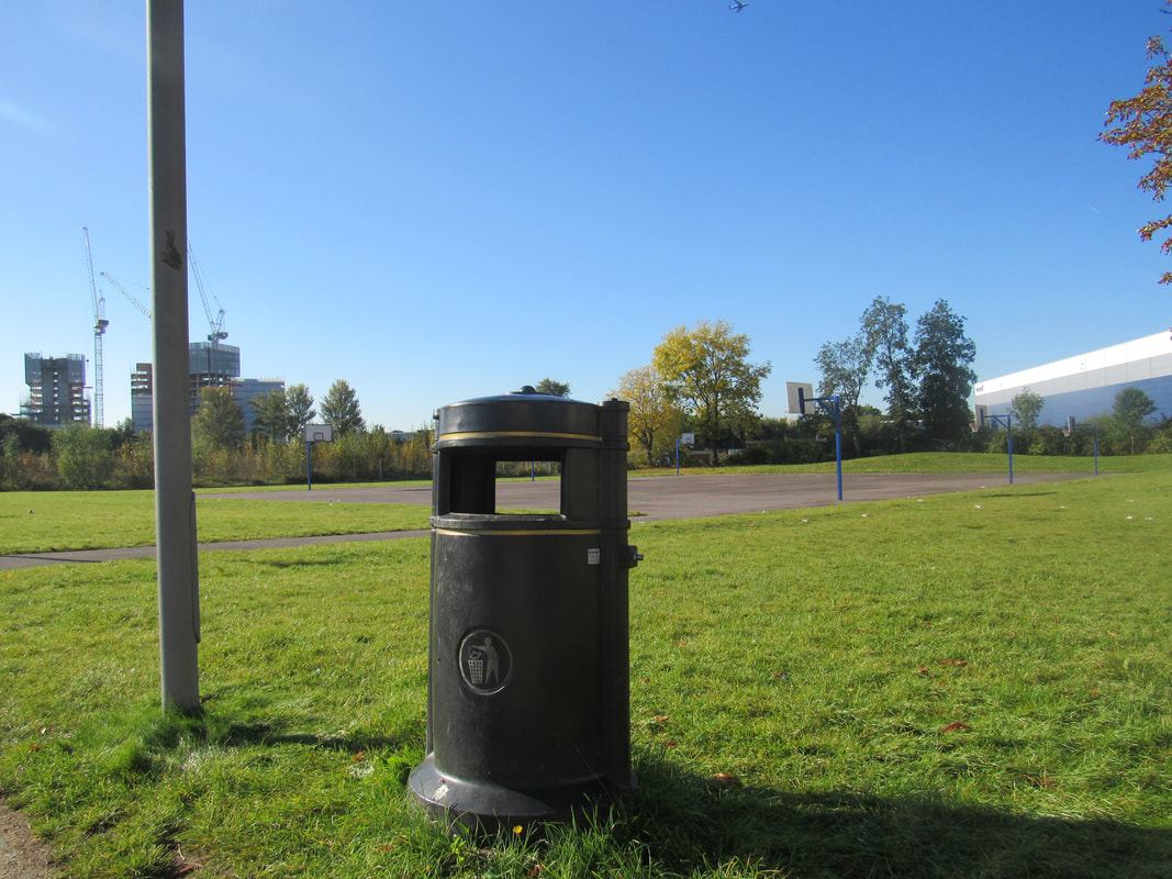
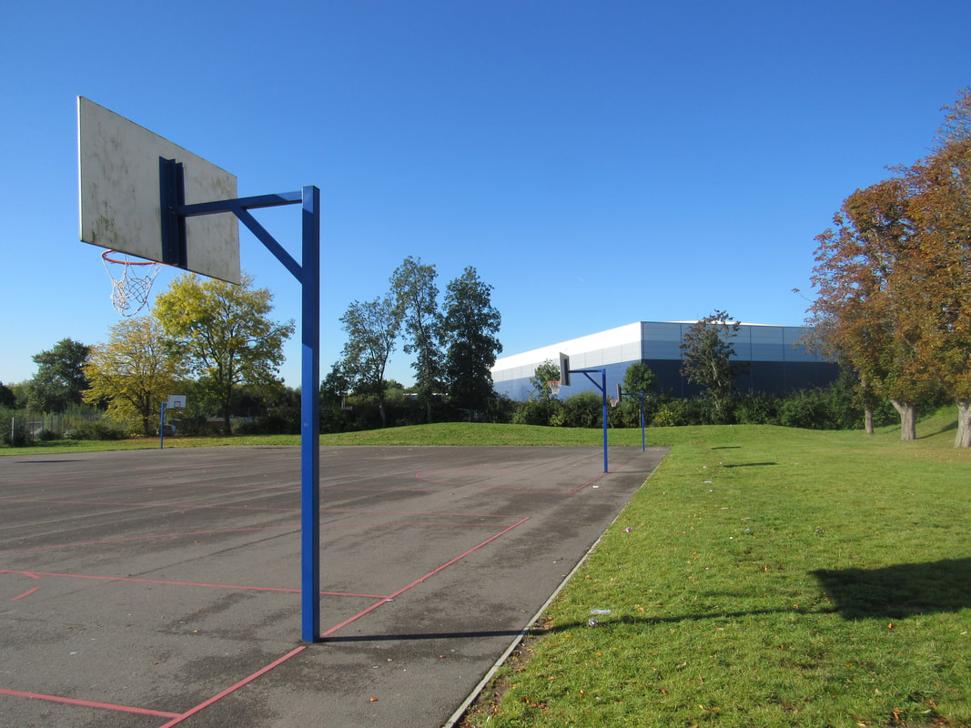
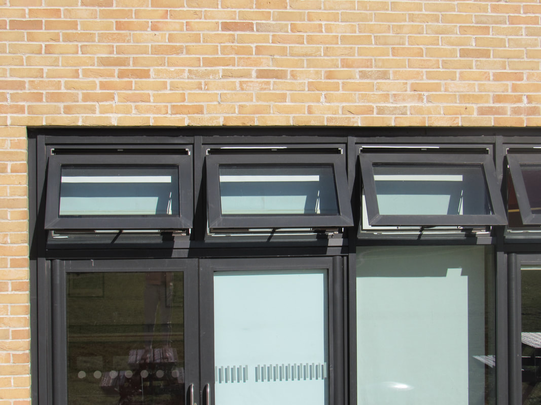
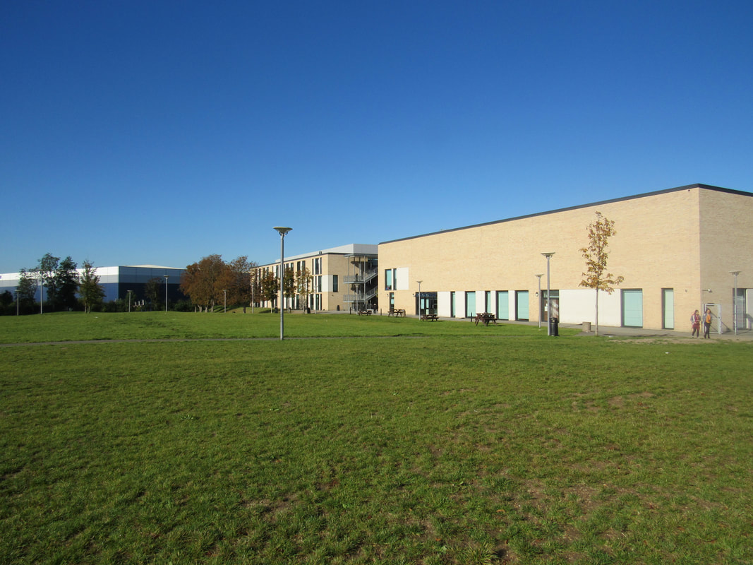
My first response to Stephen Shore - Out of school

Evaluation of my two favourite photographs:

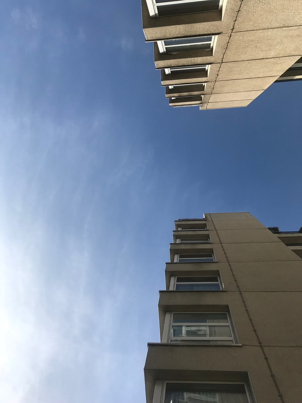
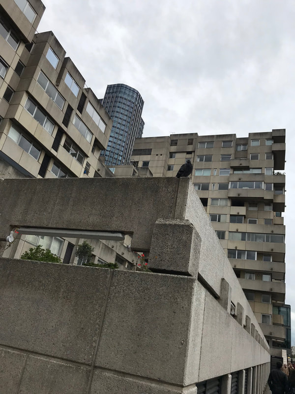
I first noticed a pigeon perched on the very corner of this grey, concrete wall. I noticed how tiny it looked compared to the surrounding buildings and what it must be like to fly. If I could fly I know I wouldn't choose to perch myself on this dismal looking wall overlooking the thames.
However I rather admire the look of this tower block as it is asymmetrical, but is still lined up accurately with the edge of the page. I love how the shiny skyscraper protrudes from the centre directly between the gap of the tower blocks, it just looks like it's meant to be there filling that hole. I find the perspective of the concrete wall, protecting the gardens of the residents from pedestrians, to be quite lovely as it finalises into nothing. It just increases the knowledge of the scale of the buildings and makes the pigeon look even tinier! |
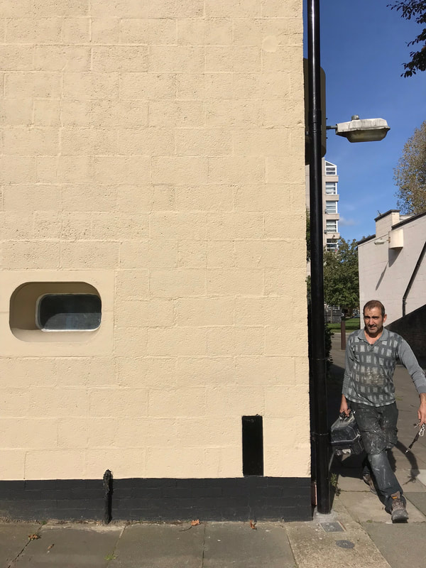
This is one of my favourites because it was the very first picture I took on this particular day. I had just lined up all my edges on the screen and then a handy-man with a tool box walked hastily through the shot. He definitely had somewhere to be as he didn't even question me taking the photograph. Maybe because he was in a hurry? Or, simply because he didn't notice? Or care?
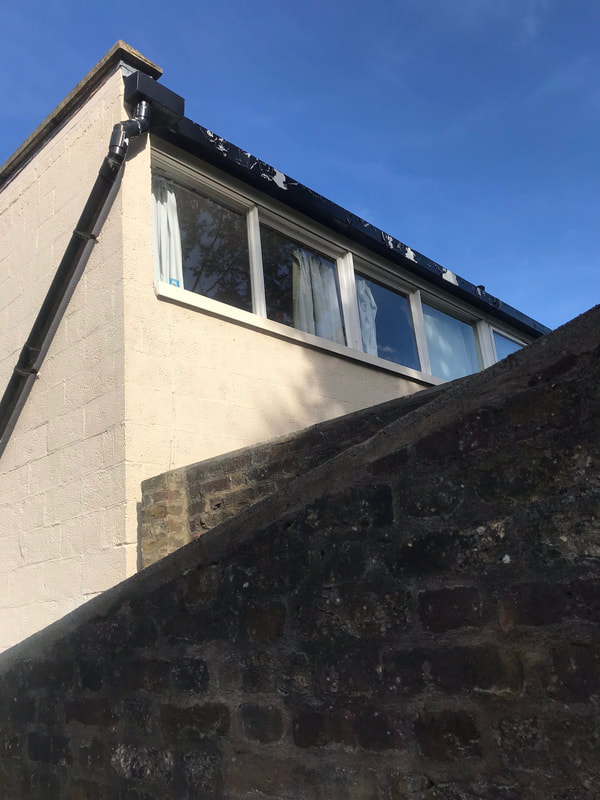
This photo was taken on a very bright day in October and the sun was making wonderfully odd shadows. This is taken fairly close to my house. I love the look of the buildings in this estate i.e deep set 'porthole' windows, the rectangular nature of the designs and the fact that all the buildings in this small area are the same, apart from the block just peeking out from under the street lamp. |
My second attempt at responding to Stephen Shore:
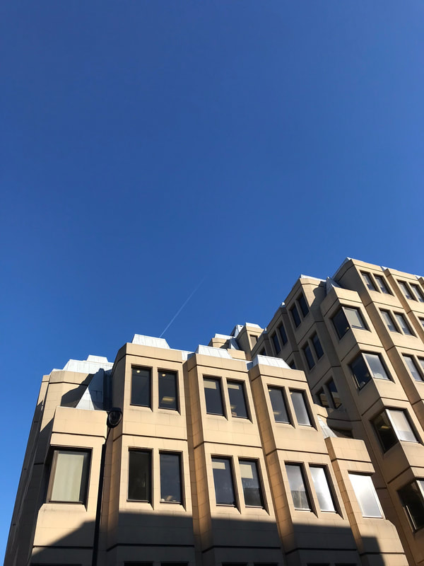
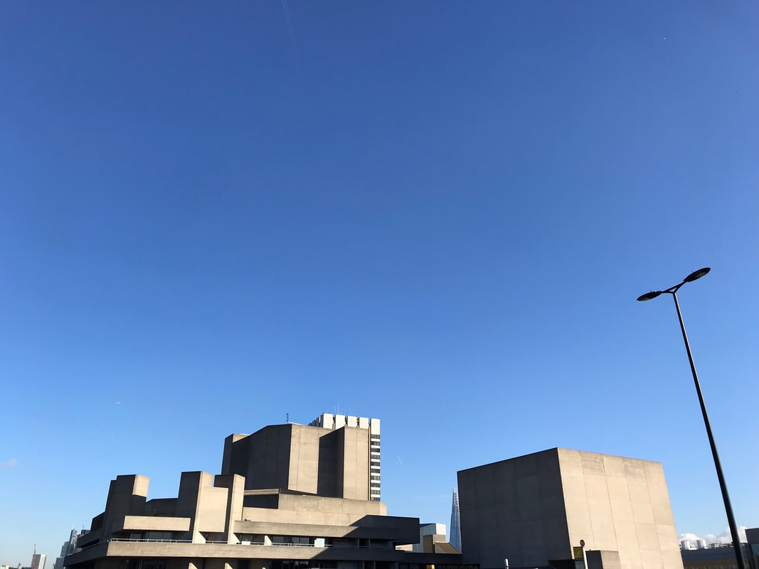
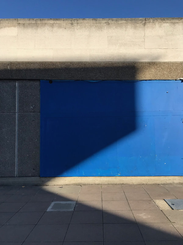
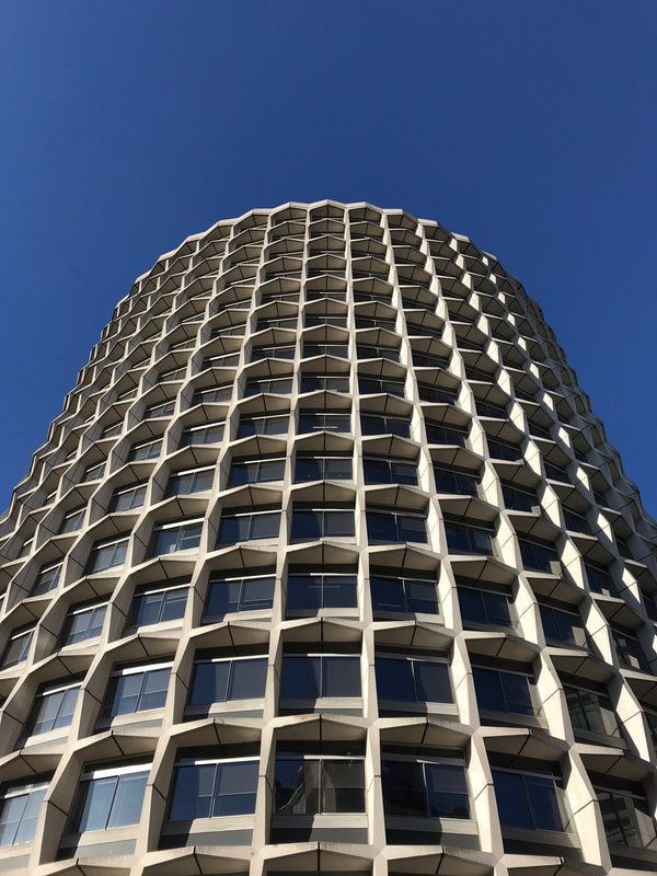
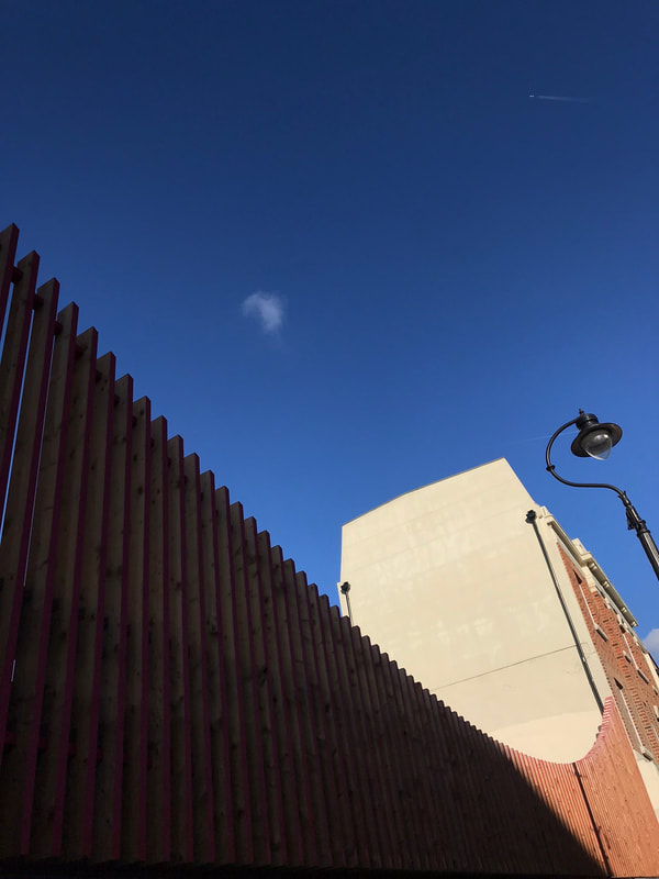
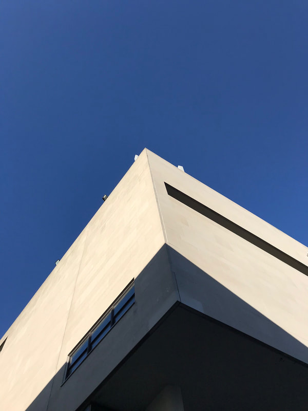
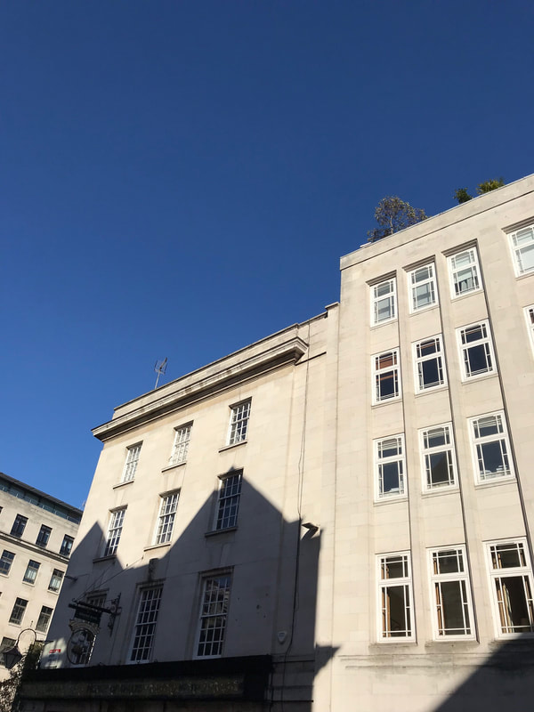
I was very fortunate to have been in central London on a beautiful crisp day like this. The sky was a bold blue which made the huge man-made structures of town stand out sharply and gracefully. The bright sunlight was creating strong shadows and lines, something Stephen Shore focuses on in his own images, giving the city life and making me appreciate my surroundings.
I feel as if my visual 'looking' skills have improved since our last picture taking task. I also feel like my attraction to simplicity and my ability to 'frame an eye-catching photograph' skills have improved. The use of primary colours and the greyish-white of most of the buildings connects all 9 images together creating a smooth engaging aesthetic. This fact of all the images looking clean, may be because I was in central London and there were more large buildings to look at however I think that as a photographer I am slowly and steadily improving, and my willingness to want to take images has become much more apparent.
I feel as if my visual 'looking' skills have improved since our last picture taking task. I also feel like my attraction to simplicity and my ability to 'frame an eye-catching photograph' skills have improved. The use of primary colours and the greyish-white of most of the buildings connects all 9 images together creating a smooth engaging aesthetic. This fact of all the images looking clean, may be because I was in central London and there were more large buildings to look at however I think that as a photographer I am slowly and steadily improving, and my willingness to want to take images has become much more apparent.
